3D Trade Heatmap For Order Flow Analysis
Orbit Charts includes a 3D Trade Heatmap that helps traders inspect trade activity, volume concentration, rejection areas, and pressure zones inside a browser-based 3D market chart.
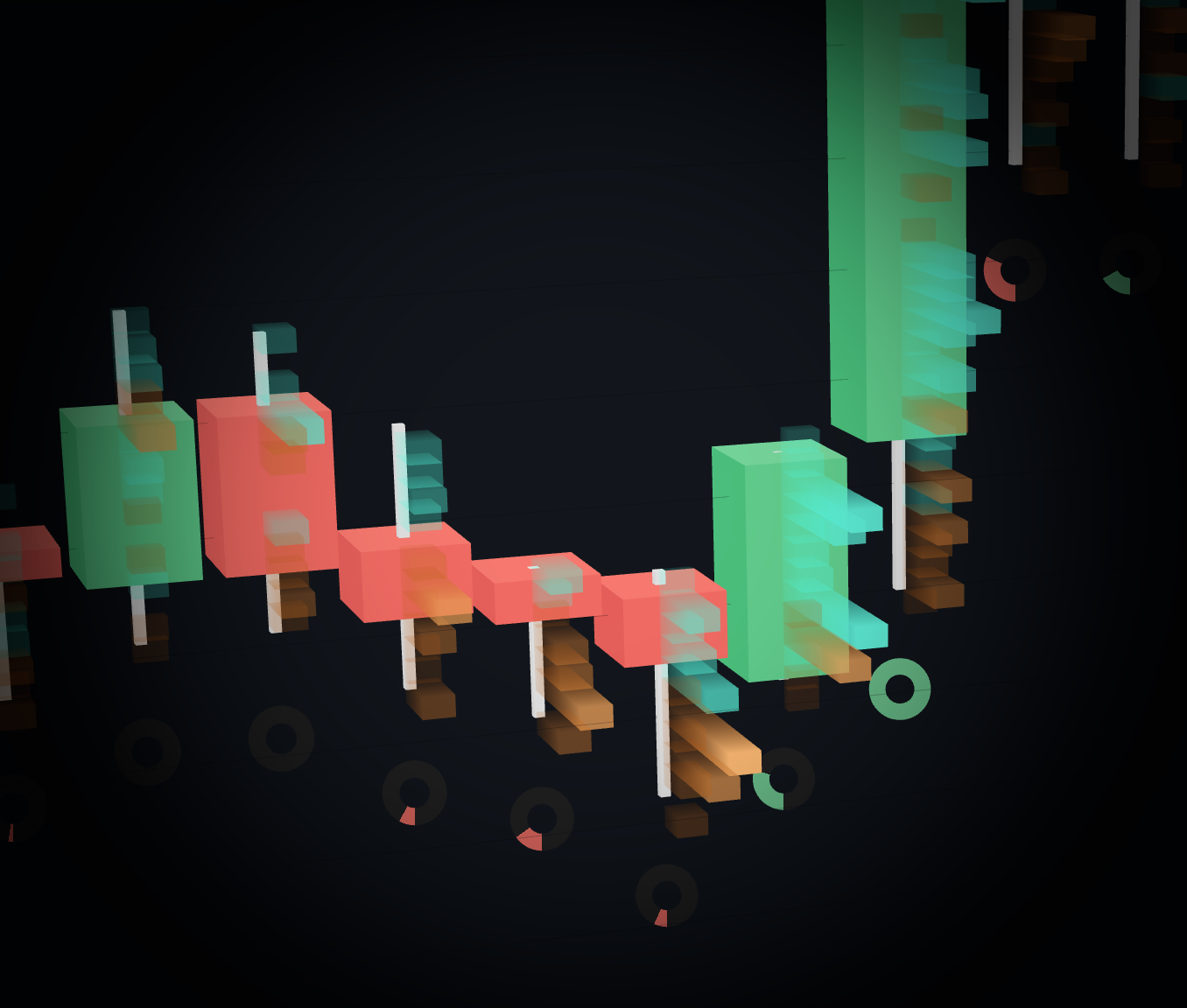
What The 3D Trade Heatmap Shows
The heatmap is designed to make order-flow activity easier to see as shape. It helps traders inspect where volume is concentrating and how pressure behaves around price levels.
Volume concentration
See where trade activity clusters around price instead of scanning a separate lower volume panel.
Pressure zones
Use the heatmap to find areas where activity builds, stalls, rejects, or pushes through a level.
Spatial order-flow context
Rotate and inspect the same market structure from multiple angles to understand the shape of activity.
Live market data
Read the heatmap with real-time exchange market data included in paid Orbit Charts plans.
From Flat Candles To Visible Pressure Zones
Traditional candles show price movement. A 3D heatmap adds another visual layer for where activity is clustering and how the market behaves around that activity.
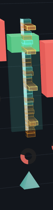
Use Heatmap Activity With Rejection Context
The heatmap is strongest when paired with other visual context. Orbit Charts also includes tools like wick absorption, market regime, sentiment, and volume tick visuals so activity can be read near the price action it explains.
Find where trade activity is concentrating.
Inspect whether activity forms a continuation, stall, or rejection area.
Use the live demo to test the visual workflow before choosing a plan.
Common Questions About 3D Trade Heatmaps
What is a 3D Trade Heatmap?
A 3D Trade Heatmap is a visual order-flow tool that shows where trade activity concentrates around price levels. In Orbit Charts, the heatmap displays activity as spatial structure inside a 3D market chart.
How does the Orbit Charts 3D Trade Heatmap help with order-flow analysis?
The Orbit Charts 3D Trade Heatmap helps traders inspect volume concentration, rejection areas, pressure zones, and activity around wicks without relying only on flat candles or dense footprint numbers.
Is the 3D Trade Heatmap the same as a footprint chart?
No. A footprint chart usually exposes bid and ask numbers at each price level. Orbit Charts uses a 3D heatmap to make activity and pressure easier to scan visually.
Does the 3D Trade Heatmap require separate market data?
No. Orbit Charts paid plans include real-time exchange market data with rapid tick-based updates over WebSockets, so the 3D Trade Heatmap can be used without buying and configuring a separate market data feed.
What markets can it help analyze?
Orbit Charts is built for real-time market analysis across supported market data coverage, with the live NQ demo available as the fastest way to try the workflow. Coverage and availability may vary by market or instrument.
Can I try the 3D Trade Heatmap in a browser?
Yes. Orbit Charts runs in a modern desktop browser and includes a free live NQ demo that opens without a credit card, account, or download.